Close your eyes. Inhale.
There is the sharp, acrid bite of burning oil, the heavy metallic tang of hot iron shavings, and the unmistakable sweetness of high-octane fuel hanging thick in the heavy New Zealand air. It is 1952 in a cramped, drafty garage in Remuera, Auckland. A teenage boy with a slight limp—the lingering echo of a childhood bone disease—is flat on his back beneath a modified Austin 7. His hands are blackened with grease up to the elbows. He is not dreaming of boardrooms or market share. He is listening for the heartbeat of an engine, trying to coax one more horsepower out of a machine that has no business going as fast as he intends to drive it.
That boy was Bruce McLaren.
Decades later, the name emblazoned across the nosecones of Formula 1 cars and hypercars alike evokes billion-dollar paddocks, wind tunnels, carbon-fiber autoclaves, and the sterile brilliance of modern engineering facilities. Yet, empires are rarely built on spreadsheets. They are built in the dirt, fueled by stubbornness, and forged by hands that refuse to stay clean.
Which brings us to a quiet, radical act of remembrance.
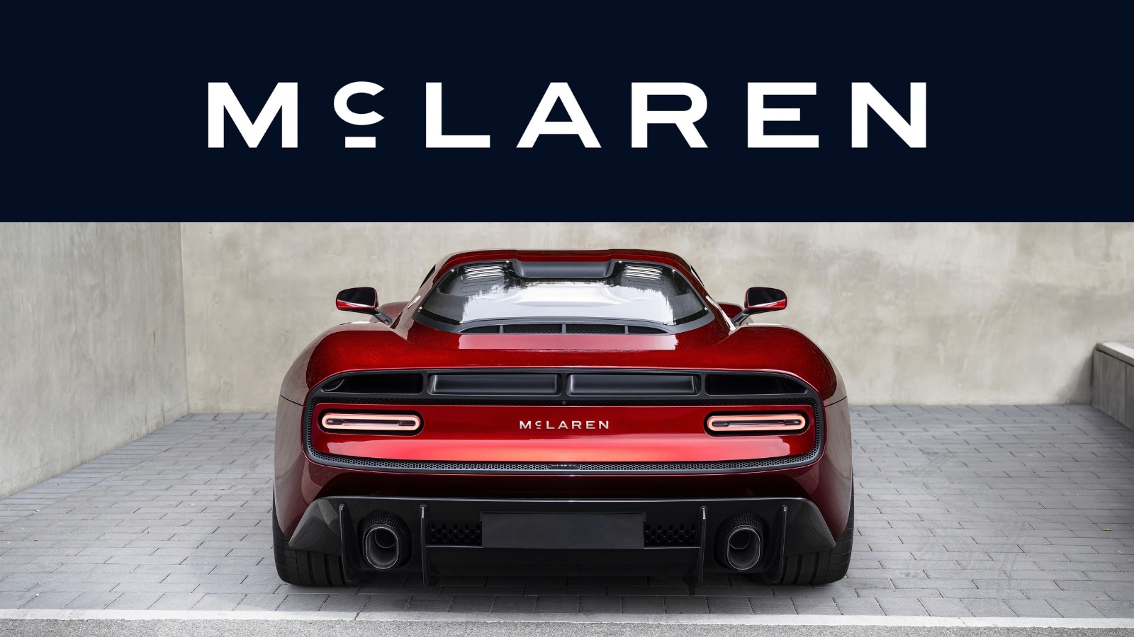
McLaren recently unveiled a brand-new logo. In an era where corporate identity has largely devolved into flat, gray, interchangeable typography designed exclusively to look good on a smartphone screen, this change swims fiercely against the current. The new badge draws its soul directly from the stencil marks and raw lettering of Bruce’s original New Zealand workshop. It is a return to the source. It is an acknowledgment that if you forget where you bled, you will eventually lose your way when the speed gets terrifying.
Consider what happens when a modern design firm approaches an iconic brand. The usual temptation is to sanitize. To sand down the rough edges until the emblem is entirely inoffensive, frictionless, and corporate. Modern design loves a vacuum. It strips away history because history is messy, uneven, and difficult to translate into a quarterly earnings report.
McLaren resisted that temptation.
Instead of moving forward into total abstraction, they looked backward into the dust. They studied the hand-cut lettering stenciled onto wooden supply crates, the faded typography on oil drums, and the hand-painted garage signs of 1950s Auckland. They found a typographic heartbeat that pre-dated corporate boardrooms by decades. By reinterpreting those forms into the modern visual identity, the company did something rare. They stitched the past into the carbon fiber of the present.
To understand why this matters, you have to understand Bruce.
He was not born into privilege. He was the son of a service station owner and mechanic. When he contracted Perthes disease at age nine—a condition that left his left leg shorter than his right—he spent over two years immobilized in a hospital bed. Most children would have surrendered to the geometry of a room. Bruce built miniature airplanes, studied mechanics, and learned the intricate geometry of movement while his peers ran across fields. When he finally stood up, he walked with a permanent limp, but his mind moved at the velocity of a racing car.
When he immigrated to Europe to race, he carried that working-class tenacity with him. He was not just a driver; he was an engineer who understood the molecular strain of a suspension arm and the fluid dynamics of air passing over aluminum. When he founded Bruce McLaren Motor Racing in 1963, his team was a band of tight-knit misfits who slept on the floor of their workshop and ate tinned beans out of a single saucepan. They won because they out-thought, out-worked, and out-cared everyone else.
When a driver straps themselves into a modern McLaren Formula 1 car today, they are hurtling down the straight at Silverstone or Monza at over two hundred miles per hour. The aerodynamic loads are crushing. The G-forces threaten to tear their helmet from their neck. The telemetry screen flashes a terrifying array of data in real-time. In that violent, deafening environment, the driver does not think about marketing strategies.
They look at the badge.
A logo in motorsport is not a mere trademark. It is a talisman. It is the silent covenant between the person inside the capsule and the hundreds of engineers, fabricators, and mechanics whose hands built it. When that badge carries the visual DNA of a dusty garage in Auckland, it tells a story without words. It says: We were built by grease, not boardrooms.
Look closer at the typography of the new emblem. Notice the subtle weight adjustments, the deliberate angular cuts, the refusal to conform to the smooth, corporate sans-serif monotony that has infected nearly every major automotive brand over the last decade. It has weight. It has gravity. It holds its ground.
This design choice is also a masterclass in modern business positioning. In a crowded marketplace where electric vehicle startups emerge daily with hollow promises and generic, tech-bro minimalism, legacy is the ultimate differentiator. You can manufacture a fast car in a few months if you have enough venture capital. You cannot manufacture history. You cannot fake the smell of burning oil in a 1950s shed. By anchoring their identity in Bruce’s original workspace, McLaren is weaponizing its own heritage against competitors who have plenty of capital but no soul.
It reminds us that the best innovations are often loops, not straight lines. We race forward into the future of electrification and artificial intelligence, but we anchor ourselves to the primitive, physical truths of our origins. We need reminders that genius often begins in drafty rooms with inadequate lighting and too much ambition.
Imagine walking into that Auckland workshop seventy years ago. The radio is playing crackling rock and roll from a speaker hanging by a frayed wire. Bruce is wiping his hands on a filthy rag, squinting at a blueprint pinned to a corkboard with bent nails. He is tired. His leg aches from the damp cold rolling off the harbor. He has no idea that his name will one day be synonymous with the absolute pinnacle of human velocity. He only knows that the next gear change has to be cleaner, faster, sharper than the last.
That is the spirit captured in the new lines of the badge.
It is easy to look at a corporate rebrand as a superficial marketing exercise. A new font here, a tweaked vector file there, a press release designed to generate a brief ripple of media attention before the news cycle washes it away. But sometimes, a brand mark is an anchor dropped into deep water. It keeps the ship from drifting when the cultural tides turn wild and unpredictable.
McLaren’s aesthetic evolution is a quiet rebellion. It whispers in a world that constantly screams. It honors the grease beneath the fingernails of a kid from New Zealand who looked at a broken car and decided it was going to fly.
The lights in the modern technological centers at Woking are blindingly white, humming with the clean, sterile efficiency of the twenty-first century. But out in the shadows of the design studio, etched into the metal of a new badge, the ghost of an old garage in Auckland still stands watch. The oil has dried. The tools have changed. The speed has broken every barrier imaginable.
Yet, the hands that built the legend would still recognize the mark.


